Wednesday 2 March 2011

Task 7: Looking back at your preliminary task, what do you feel you have learnt in the progression from it to full product?

Looking back at my preliminary task, I can confidently say that I have developed my knowledge and understanding in the creation of a media product - in all aspects: planning, filmmaking, use of camera, sound and post production.


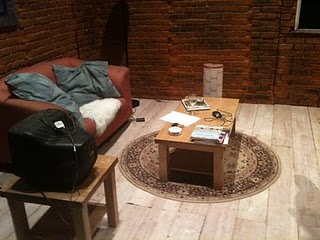
Obviously since this was a more important task in comparison to the preliminary task, we had to put in much more time and effort in the planning of 'Askew'. We weren't given storyboards, dialogues or any other details for that matter, we were simply told about the basic requirements: an opening sequence for a thriller film of up to two minutes. We had to do our own research to see what thriller opening sequences are like, so that we would have a basic idea of what the final product should seem like. We also had several options within the thriller genre to choose from; such as horror, narrative, thematic, etc. and after we had looked at all these different areas, we opted for a thematic opening sequence. In terms of arrangements, we also had to go more in depth. We got to choose our own shoot locations and so we also had to arrange the required props, actors, design a set, plan all the shots, etc. - something we hadn't done in our prelim task.


 In terms of film-making, again, more time, planning and thinking was required to be put in so that our sequence would have to visual intentions we wanted it to have. We chose to make the sequence a thematic one, therefore we had to focus on details, especially in terms of mise-en-scene. Every little thing that would be seen, or not seen, adds to a specific meaning, or feeling that would affect the audiences' interpretation upon the viewing of the final product. Details such as the mouse, was one of the shots we spent most of our times arranging. One thing I learnt was that it is important for the shot to be logistically possible and realistic so that the shot works out. We suffered in the case of the mouse, since the shot we had in mind didn't work out due to technical issues that we hadn't kept in mind (the camera could not zoom in beyond a certain point). Due to this, we had to change the shot on the day, and luckily, with the aid of post-production, we managed to make the shot look good in the final product.


Use of camera was another aspect in which we could spend lots of time on, especially since we had access to better equipment such as the genie, tracks, etc. We learned how to do focus pulls during a tracking shot, which took quite a long time to get right.
We also focused on details while framing the shot, in oder to bring about the correct intentions. This required us to place the objects in terms of rule of thirds in addition to making sure it was well lit. 
One of the shots that look us a long time to finally get right was the fruit bowl shots. Not only was it just a tracking shot, it also included a focus pull in between. We made small marks on the camera using a special kind of chalk in order to mark the positions of the focus ring at which the focus pull had to be made. The main challenged we faced was that the shot wasn't smooth - we assume this was due to some mishap of the wheels on the tripod which made the shot jerky. Another challenge was to place all the rotten fruit in the exact same position as the fresh fruit in order for the shot to work in terms of continuity. The rotten fruits were much smaller in size and so arranging them took us some time to master - we also had to add in pieces of tissue to make the fruit bowl look right.


In terms of sound, we had to tackle a completely different skill since we used dialogue that was recorded from the build-in microphone of the camera in our prelim task and decided to compose a soundtrack based on the events of the sequence for 'Askew'. We had to learn how to use Sound Track Pro, which is a great software for sound composing and mixing. We layered the voiceovers (that we recorded along in the recording studio) with ambient music and heartbeat sounds that were in the Sound Track Pro sound beds. 

Our sequence heavily depended on Adobe After Effects, which is quite an overwhelming yet extremely powerful software for adding the special effects to any video. It works in a very similar way to Adobe Photoshop, the only difference is that it is for motion instead of pictures.
We had used Final Cut before in our prelim task, however we were completely alien to After Effects. After spending our time and patience on it, we got the hang of it and played around to see what we could add to our sequence. We added in smoke, the journal entries that we had handwritten, different textured layers and we played around with colours. We found that After Effects changed the outlook of our final product and made it look like a complete polished media product.


Task 6: What have you learnt about technologies from the process of constructing this product?

Constucting this title sequence required us to use different technologies that we hadn't previously used, especially Adobe After Effects, which required patience and time to getting used to.

Task 5: How did you attract/address your audience?

Task 4: Who would be the audience for your media product?

Since 'Askew' is a thematic sequence, it doesn't reveal much in terms of the story of the film. Instead, it introduces the recurring themes and concepts that the story would be based on. Due to this, it is essential for the audience to connect the dots in order to understand the underlying themes. 

After looking at the bigger picture, one can conclude that this sequence's main theme is about gerascophobia, which is the fear of ageing. The voices in the background are that of a woman, so we can also expect her to be the protagonist of the film.

Therefore, in terms of social groups, I think Askew would appeal to young, working class women (25-35) since the story is set on a woman of that age and social group. The audience would also have to be educated, in order to make sense of the intellectual thoughts and questions the film may raise.
We also concluded that the title sequence is more of an unconventional one than conventional, and so it may appeal to sophisticated people who have an eye for creative and artistic things.


It would also appeal to older people, since the concept is, essentially about ageing, and this phobia is very common in people after the age of 40.


In spite of the fact that the voiceover in the sequence is that of a woman and the storyline may be based around her life, Askew isn't gender specific in terms of appealing towards an audience. This is because fear of ageing occurs equally amongst both; men and women.

Task 3: What kind of Media Institution might distribute your Media product and why?

I previously chose Fox Searchlight Pictures as the media institution to distribute 'Askew', however, as the final outlook of our product changed, we doubted whether Fox would be appropriate since it turned out to be more artistic and unconventional than planned (due to the use of after effects).

Fox Searchlight Pictures is a division of Fox Filmed Entertainment of the larger 20th Century Fox. They focus on making independent, British and often non-English-language films in genres such as drama, comedy and horror. They are also quite mainstream and commercial which is not found in 'Askew'.

Instead, we discovered Artisan Entertainment which we thought would be appropriate to distribute our film.


Artisan Entertainment was originally an American movie production company but was bought over by the Canadian company Lionsgate.
They've produced films such as Requim for a dream, Reservoir Dogs, Grizzly Falls and The Blair Witch Project, which are all unconventional dramatic films, with a deep message/issue underlying it.


All these films seem to have a certain unconventional yet artistic quality about them, which can also be found in Askew. Since 'Askew' would be the kind of film Artisan Entertainment would distribute, we thought that they would be the best choice and we therefore finalised the institution.

In terms of screening 'Askew' at a cinema, we wouldn't opt for a mainstream blanket release, but instead have it screened in an art house cinema.
We would, however, aim on getting high DVD sales, and we would therefore release a campaign in order to do so.

Task 2: How does your product represent particular social groups?

In terms of representation of a social group, Askew would represent young, educated women. We can convey this form two main elements: the sound (voice) and mise en scene (the diary entries)


This is one of the diary entries we used for our title sequence. We can say it represents educated young women, due to the good use of english and the articulate descriptions. The thoughts in these entries are quite intellectual - we wouldn't expect such thoughts to occur among teenagers, for example. One could also say that the handwriting is rather feminine, thus upholding the representation of young, educated women in our society. Also, the fact that these are diary entries reinforce this, since men don't usually keep diaries however it is common among women to keep journals and diaries to record their thoughts, moods and feelings.
In terms of sound (the voice of the woman), makes it clear that it is a woman speaking - she is simply reading her journal entries.

As time passes by, the handwriting and thoughts of the journal entries deteriorate - there are ink bleeds, blotches and stains across the page, and the thoughts she is writing about become darker, showing us her gradually turning insane. We could argue that this sequence could also represent mentally ill people, due to these elements that represent madness and insanity.

Task 1: In what ways does your media product use, develop or challenge forms and conventions of real media products?

When designing our title sequence, we had to make sure the titles followed the general conventions of a real media product and so, we ensured that they could be clearly understood and interpreted in the right manner. However at the same time, we didn't want the audience to lose interest, so we had to create a balance between upholding the general conventions of a film title sequence and creating a challenge to maintain audience interest.


This first title of our sequence is of the distributor of the film. It upholds the general conventions of a title sequence because the first title is always that of the company that finances the film. We also made sure that the size of 'Artisan Entertainment' is larger than 'presents' since that draws focus on the more important segments of the title.

At the same time, the design of the title also challenges conventions when viewed by an audience, in the sense that it is composed of several layers which create a 3-D effect, which not many films have. However, we've made sure that the significance is still on the titles, so we've blurred out the other words in order to achieve that. In addition to that, we also decided to handwrite the titles, since the diary entries are also handwritten thus adding to the thematic feel of the sequence. There is also a light bulb that flickers in the background, which ensures that the audience will have something to observe at all times. Not only does this keep the audience engaged, it also requires them to input some effort into filling in the blanks of the hidden meaning behind this sequence.


This is the second title of our sequence which is of the production company who are next in line of importance in terms of the production. It follows and challenges conventions in the same way as the previous title.


This title conforms to the order of the list of titles in terms of importance, since the director of the film is the next important person involved in the production. 
The background is now a different one, again with a lot of different elements in order to keep the audience involved. However, when the title appears, all the other layers are out of focus, so that the title attains all the attention. We also had to ensure that none of them were too distracting, like the smoke, for example. We managed to achieve the desired effect after playing around with it for a while.


The next title in the order of importance is that of the actors. Since this film would be a low-budget film if it was made, we came to the conclusion that the actors wouldn't be very well-known - this is why we decided to display three of them at once.


The director of photography comes next in the list. We also added a focus pull after this title, so that the audience could read the diary entries (which are out of focus when the titles are displayed) and make sense of them.


The next title is that of the original score. Since the sound in this sequence is quite significant in the creation of the thematic feel and in conveying the message of the sequence, we decided that the sound design was an important title to display. 
One of the key moments of the sequence is the disappearance of this title - a puff of smoke blowing the titles away as they travel past it. The smoke idea is carried forward from the previous title and it also ties in with the concept of 'askewed' thinking and vision which we are trying to convey through this sequence.


The next title displayed is that of the writer of the screenplay. In terms of framing, we made sure to place each title in a different place for every shot, yet we kept the rule of thirds in our minds when doing so, in order to make sure they are still placed on one of the 'hot spots'. We also made sure the background layers could be clearly seen, thus we opted for the focus pull between the titles and the diary entries again.
Colour is another significant element that we used in the production of this sequence. Notice how we started of with a back background, which gradually transformed into a blue followed by purple, and then red. After this shot, it turns back to black (and white). This ties in with the idea of the protagonists life degrading up to the point of insanity, which is represented by the colour red in this case.


The production design in our sequence plays an important role in this sequence so we decided that this would be the next most important title. It holds and challenges the same conventions as the previous title.


This shot is now in black and white thus representing the idea of the protagonist's life beyond insanity. The title of the editor, who is the next important person involved is now placed in a different "hot spot", since this is a different shot. We've re-introduced the smoke idea, since it is a key concept of the sequence.


The producer is the next title - since he is in charge of all the people whose titles have passed.


The director is mentioned once again, to draw significance of the importance of this person's contribution to the whole production of the product - from pre-production, through the shoots, and then the post-production.


This is the final title of the sequence; the name of the film. This is usually displayed at the end of the title sequence, and the story of the film starts after that. Askew follows this general structure, thus upholding media product conventions.